I’m back! After a whirlwind four weeks teaching Theatre Performance at the Georgia Governor’s Honors Program, during which I squeezed in a few costume design guest lectures for the Theatre Design department, I’ve finally got enough space in my brain to devote to the fantasy clothing corner of my heart.
The dress I’ve been working on simultaneously with the Siren dress is the Anne Boleyn gown – for many, many reasons. A woman who changed history, brought the Catholic church in England to its knees, kept one of history’s most notoriously fickle monarchs chasing after her for years before she let him get what he wanted, a woman who loved fashion, spoke multiple languages, was brilliant, charming, skilled, religious, determined, ambitious and ultimately terribly unfortunate – how could I possibly resist?
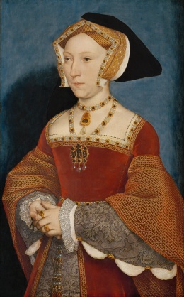
When I started researching, I knew I wasn’t interested in making yet another copy of Jane Seymour’s Holbein portrait dress (right). For one thing, it’s been done hundreds of times; for another, Anne’s innovative and experimental fashion sense is well-documented, and, finally (personal opinion incoming – take with grain of salt), I don’t think Anne Boleyn would have been caught dead in the type of gown that Jane Seymour would choose to define her public image. I also don’t think that Jane Seymour would have chosen to sit for Holbein in a gown that would instantly remind her husband of the former wife he loved and executed. So – thanks, but no thanks.
I pulled research images from a number of sources, all early 1530s or earlier. After all, if you’re going to create new fashions, you’ll always end up drawing some inspiration from a few styles that were popular years ago but have since been relegated to the “old-fashioned” bin of history. I loved the idea of telling the story “Anne Boleyn – what the king first saw”, so I was drawn to simplicity rather than majestic opulence. My favourite bodices all ended up being black with gold trim and embroidery, and they were more casual – no stiff undersleeves as in the Seymour portrait, just casual white linen shift sleeves. Some jewellery but not nearly as much, and certainly not as much detailled gold embroidery as on the large Seymour gown sleeves. She was only Lady Anne Boleyn, after all; her father wasn’t elevated to the peerage until after she caught the king’s eye.

")


The use of the colour black depended heavily on its hue – most middle-class women had a black dress, but the deeper, richer and darker the black, the more expensive it was. Excellent. A deep black – mysterious, demure, rich, elegant and designed to highlight the face rather than the gown – perfect.
Then I wanted an accent colour – something that would catch the eye, but something slightly unusual. I thought about Tudor green for awhile, but that felt too much like obvious pandering to flatter the king. Red wasn’t an option – of all the colours, red was used more often than most in Tudor fashion. Eventually, I found a paragraph in one of my many historic dye sources stating that blue was often used for servants’ livery, and I knew I’d hit the jackpot.
What? Think about it! Picture the uniquely powerful monarch staring at an unattainable young woman with dark hair, confidently dressed in a mature, dark, deceptively simple gown of expensive black velvet, while her underskirt and revealing hood both signal “I am your servant”.
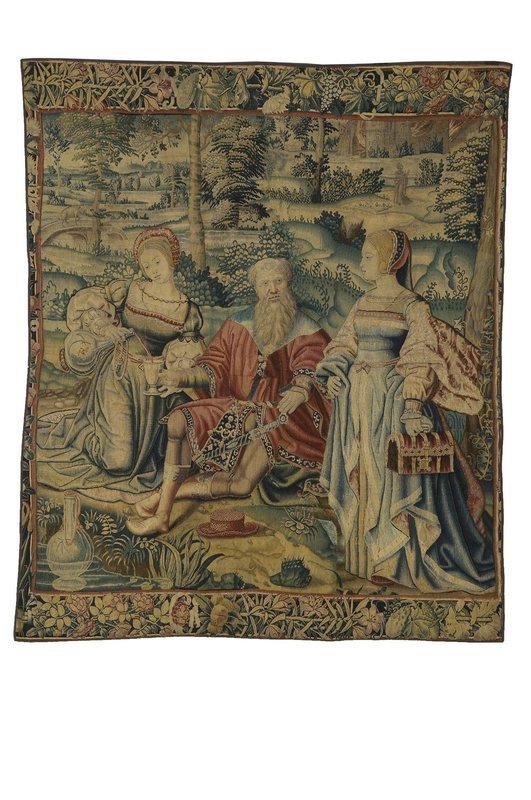
This ended up being my favourite image for the skirt. Women often tied their gown skirts up and out of the way, especially for practical reasons, and I loved the folds in the front right skirt depicted in this tapestry and the way they were enhanced by trim and a contrast lining fabric.
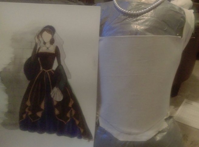
So, pulling together those inspirations, this is what I drew:


First of all, I knew I’d need to drape the bodice myself. I’ve got a lot of terrible Simplicity/Butterick/McCall patterns, and the lines are just WRONG; they look like modern square-neck gowns with princess-line bodices, and Tudor bodices have no front seams at all, while the Tudor neckline is set so wide that the sleeves often look as though they’re almost falling off the wearer’s shoulders. The back neckline is also not square; it’s actually diagonal, which is brilliant, because it keeps the sleeves on the shoulders. Sorry, popular commercial patterns; you’re not good enough.
I could have spent money on some of the excellent Tudor patterns that are out there, but when you can drape your own, spending upwards of $40 on patterns is wasteful.
My biggest hurdle was figuring out how to circumvent the MANY layers that go into a true Tudor gown: the linen shift, the sleeveless kirtle (which is basically a gown – but you only end up seeing the skirt as the “underskirt”), the sleeved gown, whose skirts are split open at the front to show the kirtle skirt, and the stomacher – a stiffened panel that is pinned across the front of the bodice (or the stomach, lololol) in order to cover all eyelets/lacing and to create a smooth shape.
If you zoom in on the Jane Seymour portrait, you can actually see little gold pins in a vertical line on the side of her bodice.
This is a LOT of layers. I wanted a tiny, tiny waist, because vanity. This meant just a shift, an underskirt, and a sleeved gown. I also needed the gown bodice to keep its shape through a photoshoot in south Georgia. In the summer. In the humidity. This meant that I couldn’t stiffen the gown bodice with historically accurate buckram, because buckram is built to mould itself into manipulated shapes when exposed to heat and steam/water. Which is precisely what sweat is. I’d end up with a heavy bodice shaped just like me by the end of the photoshoot, not that specific conical Tudor shape. Corsets and heavily boned bodices did not exist until decades later. So what to do?
I ended up asking my engineer/hacker/maker boyfriend for advice, and he suggested plastic embroidery mesh. I laughed at first, but then he brought me a sheet of it, and…um, this stuff is magic.
That’s just one sheet of black plastic embroidery mesh pinned into a muslin mock-up with about four safety pins. Not a single wrinkle. Smooth as can be. A little more sturdy and rigid than multiple layers of buckram. Doesn’t buckle at the waist. It actually flexes a little when you move, much more than flat steel boning. You can zig-zag pieces together on the machine! It breathes quite well because it’s got so many large holes, and it takes a LOT to rip this stuff.
I found mine in the clunky cross-stitch section at Michael’s. The sheets are about the size of a regular piece of computer paper. I had to zig-zag the edges together to create the larger pattern pieces, but that worked beautifully. I only used one single piece of boning in the entire bodice (center front) and I didn’t even need that one.
I ended up getting my velvet from Rodeo Home – Home Fabrics and Trims. I chose their Gian velvet, which is heavy enough to keep its shape and could even be used for light upholstery, but which drapes beautifully and has the glamourous, luxurious sheen of silk velvet. They don’t give you tracking numbers, which I do wish they would fix. I sat at home nervously worrying for eight days before my fabric finally arrived.
I could have used cotton, but I wanted the sheen and the drape; all the cotton velvet I found only had a dull sheen and wouldn’t have looked right. Silk velvet would have been awesome, but I don’t have that kind of money.
To minimize bulk under the gown, I chose a very sheer linen gauze for the shift. My favourite source for regular-width linen is fabrics-store.com, and the IL030 Bleached is so thin and so comfortable that it was perfect for this simple, square-necked period shift.
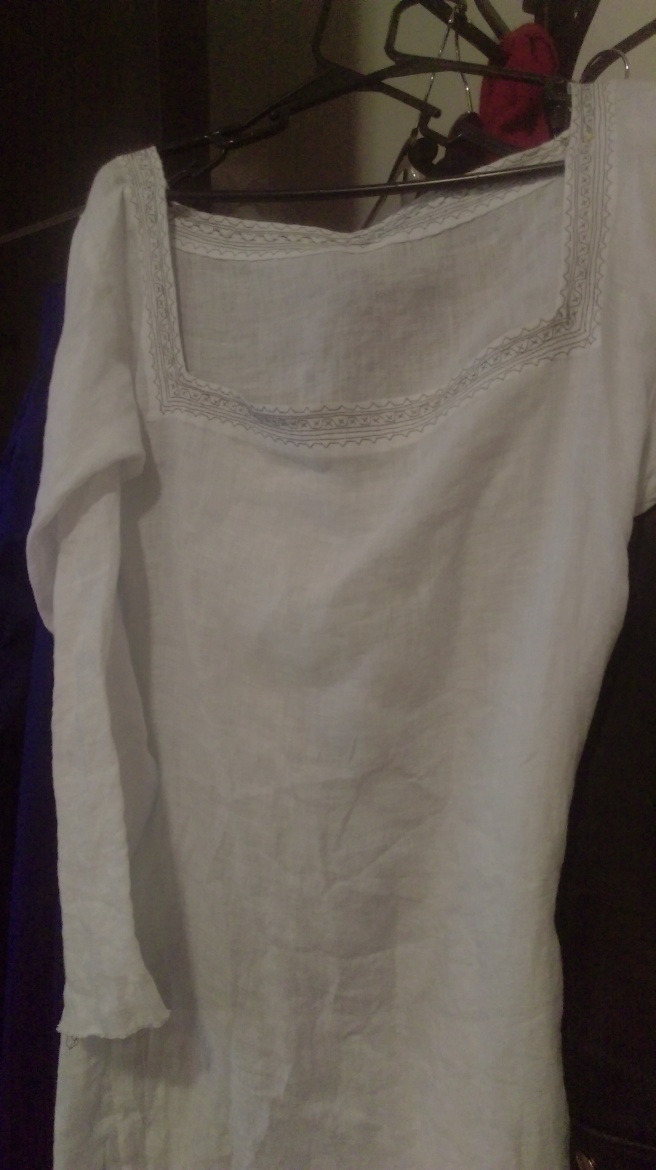
I’ll write a more detailed post on this shift; it’s an authentic period shift pattern to which I added some blackwork embroidery around the neckline. It also received cuffs and pearl buttons, both of which were added after I took this picture. The linen fabric made this an ideal underlayer; the photoshoot took place in a very hot loft in the afternoon in south Georgia in late June…which theoretically had air conditioning but it hadn’t been turned on all day, so this linen shift was instrumental in helping me survive 90-degree heat in a heavy polyester velvet gown.
I bought the underskirt fabric locally at Fine Fabrics in Norcross, GA. It’s not a place I go to if I want quality fabric, but if I want something that looks right, is affordable and when accurate fabric content isn’t really a concern, this is where I go. Four yards of sapphire faux silk taffeta and four yards of black polyester organza – since I wanted the skirt to be a little stiff and not to wilt under the velvet, I flatlined each piece with the poly organza, then cartridge-pleated everything to a grosgrain ribbon waistband, and hand-hemmed the taffeta to the organza (which means you can’t see any of the hemming stitches in the outer layer of blue taffeta).
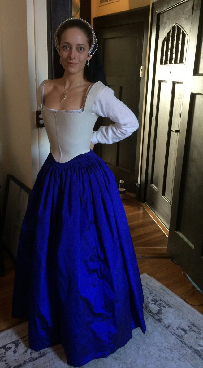
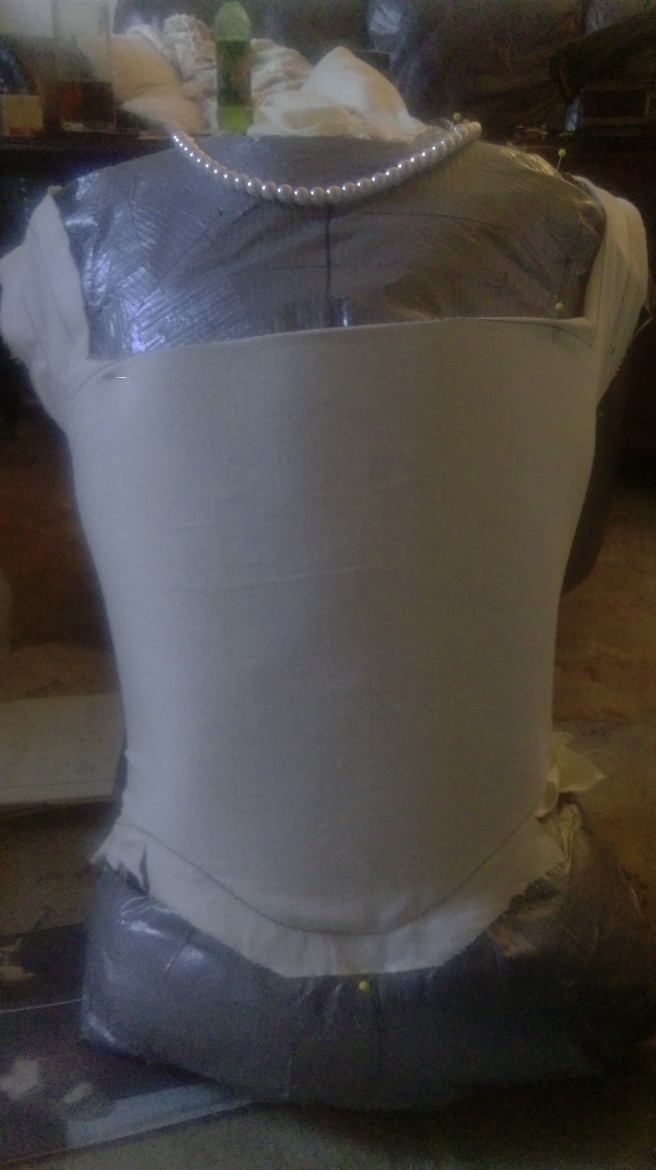
Fitting the skirt and the mock-up bodice – you can just barely see the shift sleeves with finished cuffs, as well as the hint of blackwork on the neckline of the shift.
WHEW. Finally, with all the nervousness of a person who knows that it’ll take over a week to replace any ruined fabric from Rodeo Home, it was time to start cutting out velvet.
Note to anyone sewing with velvet who hasn’t done so before: you HAVE to cut out all your pattern pieces facing the same way, otherwise some will look a LOT darker than the others because of the way the nap faces. Because viewers will be looking down at this dress (from eye level down), I cut out all my pattern pieces so that when I ran my hand UP the bodice, it felt smooth and silky; when I ran my hand DOWN the bodice, it felt rough.
This meant that the dress would look deep black, not shiny acetate black/gray.
Now, there are three layers in this bodice:
- the plastic mesh, each pattern piece stitched to a layer of muslin, which wraps around the edge of each pattern piece to cover the edges. Then the muslin-covered pieces are zig-zagged together so that the edges do not overlap but are sturdily fastened together and lie completely flat.
- The velvet outer layer,with the side/back seams carefully hand-stitched before being machine-stitched (otherwise the velvet slips out of place on the machine), then its seam allowance cross-stitched by hand to the inside of the plastic mesh/muslin layer
- the white linen gauze lining, slip-stitched by hand to the bodice edge all the way around.


This is a lot of hand-stitching, you guys. Really a lot.
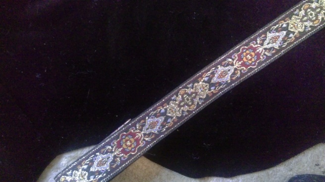
Then came even more hand-stitching: the trim! I couldn’t machine-stitch this down, because I wanted the perfect, flat control that comes with hand-stitching. I also had to sew two different types of trim together to get the wide look that I wanted. These were the three types of trim I was choosing from:
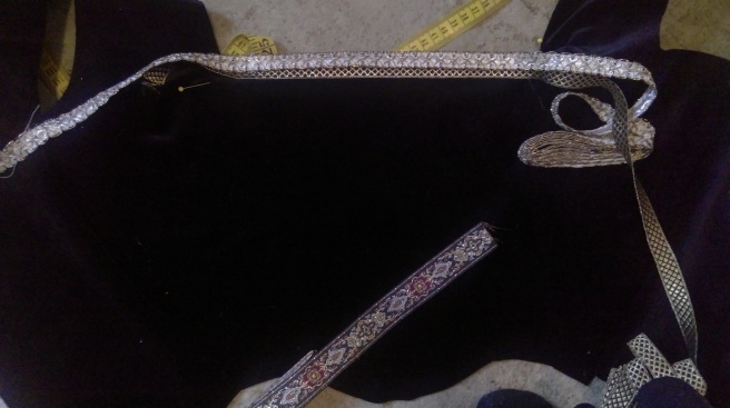
I ended up just going with the top two. The bottom one was pretty, but had much too much red in it.
So, after even MORE hand-stitching, this is how the trim around the bodice neckline turned out!


Place the lighter trim higher up, drawing attention up and towards the skin and face, and creating a gradual transition from black to gold to white.
That finishes off Part I of Anne Boleyn’s gown!
Next: a detailed look at her shift, the contrasting skirt lining and trim, the hood, the sleeves, the invisible laced closures (of which I’m absurdly proud), the necklace, and the final photographs…

One thought on “Anne Boleyn – Part I”